Social
Branding
Web
Mobile
App
Print
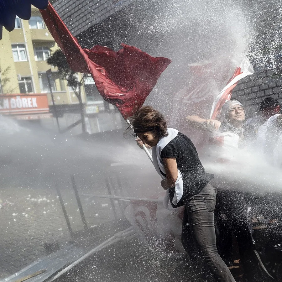
Where history meets hustle. Sailors & soldiers to street art & soul.
We believe that a strong set of values is essential to achieving success. These values guide our actions and decisions and shape our culture and identity. Our key values work in practice by these outcomes.
Guts
Resilience
Initiative
Team Spirit
Creative Digital Design
Web
Mobile
App
Creating a design language for Singtel Digital, the digital arm of Singtel / Optus. The goal is to provide a framework for a coherent visual experience while leaving flexibility to differentiate by service types and sub-brands.
Insights
To arrive at our insights for our project we completed the following. Review of existing Singtel Digital research material from all relevant markets. Completion of desk research. Review of existing customer segments. Definition of relevant x-market customer archetypes.
Learnings
While completing these activities, we learned and synthesised a collection of insights. Our main customers have grown up using the internet. They are used to global services and design quality. Many are cost-driven and use feature phones, or recently upgraded to smart phones. They are not impressed or motivated by real-world physical metaphors ie skeuomorphism.
Visual design language
Our conclusions are the implications for our future design language. One single, x-regional language can cover all markets. The design should live up to global trends and best practices, but be flexible and unique enough to stay relevant when the flat trend dissipates. Design needs to be light-weight to ensure fast performance on slower networks. The design language should avoid skeuomorphic elements
Trend Analysis
To arrive at our insights for our project, we completed the following activities. Review of three corporate case studies (Google, Microsoft, USA Today). Conducted a broader global visual trendscrape covering visual aspects such as use of color, iconography, grids, and typography. Review of secondary aspects such as interaction design and animation design.
While completing these activities we learned and synthesized a collection of insights. Case studies rely on stronger rootbrands and prioritise its promotion over the sub/partner brands. Global design trends leverage a more minimalist design, where traditional layout, colors, and typography is skillfully used to create experiences that are more consistent across services and platforms.
Our conclusions are the implications for our future design language. Compared to case studies, GDL DLS needs to allow for more differentiation between services and service genres. Introduce a strong icon language and unique typography and color palette to create identity. With global design trends given, we still need to find means to push it further, stand out, and to differentiate.
The solution
We developed a design language that responds to global design trends. For our design language, we started with the basic learnings from our trend-scrape. We tried to create a system that allows more flexibility than what we have observed in our case studies. We also wanted to respond to the key visual trends we found:
• Flat and simple shapes
• Large and courageous use of typography
• Simple, monochromatic iconography
• A diverse color-spectrum
Where possible we wanted to push the trends a little further, to create unique and own-able aspects for the GDL visual language. While icons and other visual elements remain flat and are presented on simple primary shapes, we added some layered depth that will pull customers in and continue to engage them ‘on second sight’. We leveraged the global trend of simple flat shapes and added an element of depth to it. Through stacked, overlapping flat panels we can create visual priorities on the one hand, and unique own-able quality on the other. According to our conversations, a GDL news service, curative by nature should remain neutral and make its content shine. In response, we suggested a less saturated blue base color combined with orange accents as the main service colors.
Branding
Web
Mobile
Bondi Innovation mission is a supportive community of innovators, drawn to the healthy lifestyle and energetic spirit. But imagine unlocking your full potential! A dedicated hub connects these minds, fostering collaboration and boosting the entire Bondi economy.
Fueled by Bondi’s vibrant energy, I’ve partnered with diverse clients—from budding startups to global giants—to craft design solutions that spark real-world impact. I thrive in collaborative environments, working closely with entrepreneurs and start-ups to ensure every design choice fosters connection and enhances the user experience. It’s not just about aesthetics; it’s about creating meaningful interactions that drive positive change.
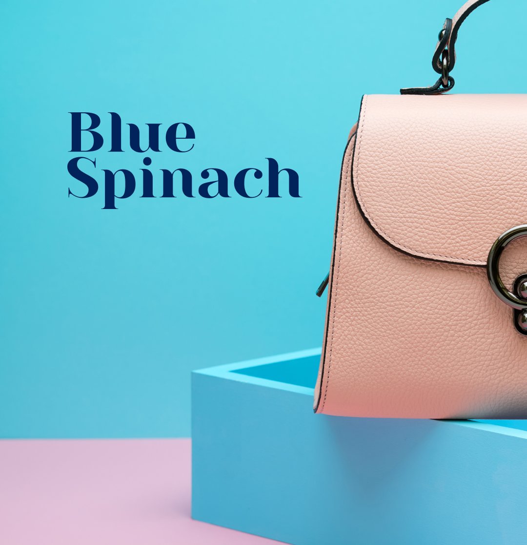
Branding
Web
Artichoke was evolutionary in the brand direction, taking an established brand and evolving it effortlessly into the new chapter of Blue Spinach, creating a more sophisticated brand would allow the brand to evolve into a true designer brand”
Loyalty
Brands are ideas that keep growing. We create the building blocks: the strategy, symbol, logotype, typography, color scheme, iconography, illustration style, visuals, animations, motion design, photography style, sound design, messaging, and tone of voice. But ultimately the brand creates itself – in the minds and hearts of the audience.
Save loyal users – Gain the trust of new users: The presence of standard rules and principles within the visual language accelerates the creation of marketing assets and creates uniformity throughout the visual layer of the brand. Consistency evokes trust.
Reduce costs and save time when launching new products: The process of creating new products, maintaining uniformity, and managing a brand is becoming more accessible, faster, and cheaper with a transparent visual hierarchy system.
Make the change
Inform customers about changes in the company: The brand system generates an external harmony that evokes a feeling of balance throughout all of the company’s products and services on offer. Often, updating a visual identity is a way to make internal invisible changes, externally visible to the people that use the company’s products.
Increase team motivation: Attractive visual identity positively affects a team’s motivation levels as well as their state of mind because it conveys the values and principles of the company.
UX/UI
Web
Mobile
App
Artichoke’s ability to define and research the ability to redefine the website to ensure the business capability to increase the sales of the Entertainment brand was readable. The new UX and UI increased sales by 35% in the first month.
UX Wireframe
A wireframe is a low-fidelity design layout that serves three simple but exact purposes: It presents the information that will be displayed on the page. It gives an outline of the structure and layout of the page. It conveys the overall direction and description of the user interface.
UI Visual Design
Interfaces should not contain information which is irrelevant or rarely needed. Every extra unit of information in an interface competes with the relevant units of information and diminishes their relative visibility.
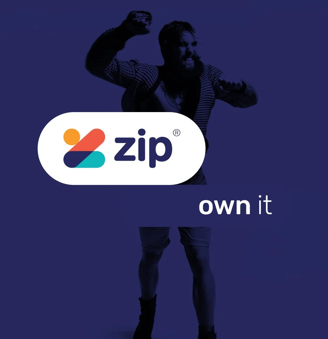
Branding
Web
Mobile
App
Strategic Brand Evolution for Zip
A UX/UI Designer's Perspective. Collaborating closely with Zip, I embarked on a journey to redefine their digital brand identity, aligning it with their ambitious growth trajectory. Leveraging my 20 years of UX/UI design experience, I crafted a comprehensive style guide and logo that captured the essence of the brand while providing a flexible framework for future expansion. The project encompassed a deep dive into iconography, typography, color theory, photography guidelines, and user interface design, ensuring a cohesive and impactful brand experience across Zip's diverse range of products and services.
UX/UI BRAND CONSULTANT
To advise the Hungry Jacks team on best UX/UI principals for ongoing and upcoming digital applications ensuring the experience is wholistic consistent with all touch points of the customer, placing them first from ideation to delivery of digital products.
USER EXPERIENCE CONSULTANT
CREATIVE DIGITAL DIRECTOR CONSULTANT
Red Rooster entered the food home delivery market by offering their own successful home delivery application, making sales of over 30 million in the first year of operation. I was responsible for all user experience and visual design for the mobile through to desktop experience. The key was to visually focus on the product and make the process of purchase as clean as possible. The team that delivered the app was extensive from IA experts, POS system experts, back-end front-end dev, in-house IT coordinated by weekly sprints and showcases.
CREATIVE DIRECTOR
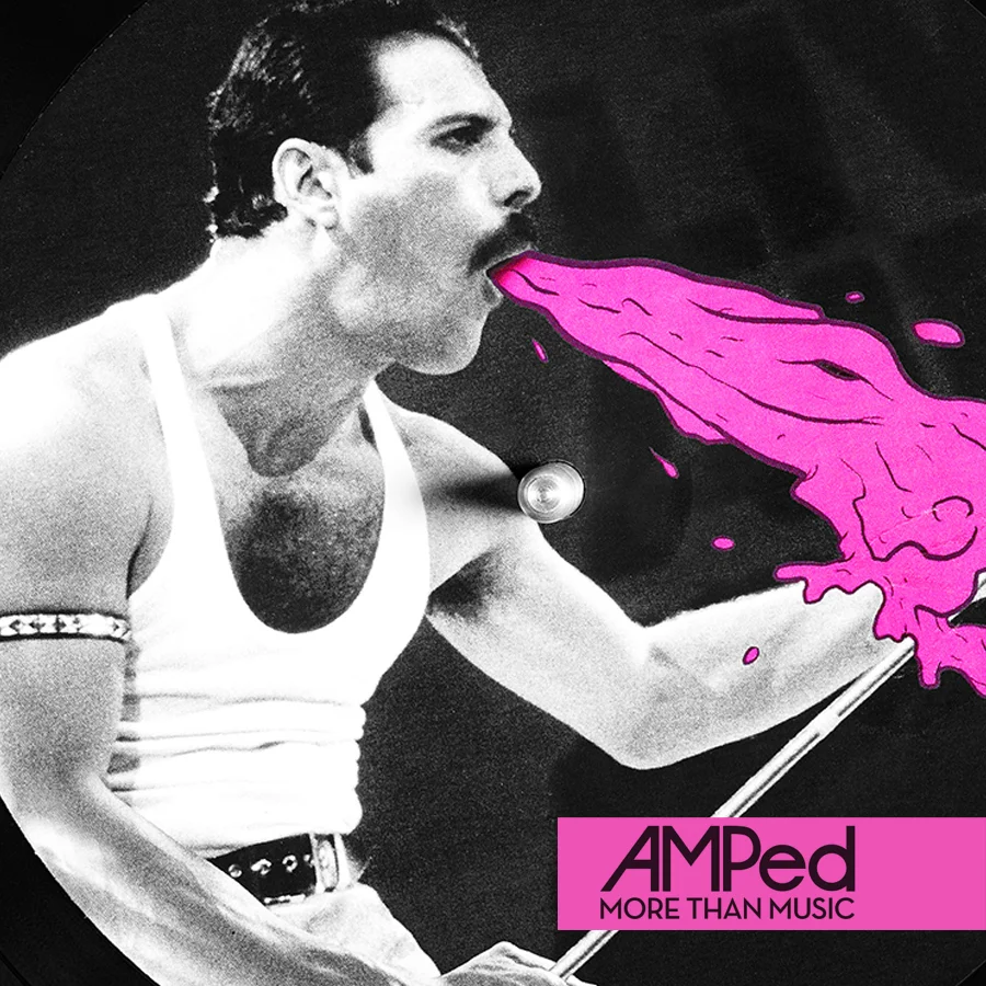
Energy, simplicity and inspiration from iOS7 is shaping the new cleaner, more confident AMPed design. We have started with a fresh new logo without loosing ties to the original core value. The Less is More approach has been embraced in the design adhering to both GDL style guide but heavily influenced by iOS7. Transparent backgrounds, clean white navigation, and exciting transitions will make the App both fun and desirable.
TEAM
Creative Director | Michael Signal
Senior User Experience Architect | Fay Afshar
Senior Interaction Designer | ErinErin Jeavons-Fellows
CREATIVE DIRECTION
BRAND INTERGRATION
Money talks, but design matters when it comes to NFC payments. My team worked with a number of stakeholders including Optus consumer and Optus Branding to form a unified experience.
The key to the design was to build an App based around trust. The core screens were designed to pixel perfection, ensuring all stakeholders were more then happy with the end result.
REVIEWS
Cnet
Gizmodo
news.com.au
lifehacker
businessspectator
THE TEAM
Creative Director | Michael Signal
Senior User Experience Architect | Fay Afshar
Senior Interaction Designer | ErinErin Jeavons-Fellows
THE DESIGN PROCESS
Discovery Research
Very simply, this phase is all about defining the market, the needs, and the opportunities. What are the core mechanics and drivers of the business and stakeholders? What are the existing pain points for Optus consumers? How can we better serve the needs of the user and help them easily pay for products? What problem are we trying to solve.
Innovation Discovery
Informed by the previous phase, the team started the journey toward relieving pain points, serving needs, and delivering on identified opportunities. Our goal was to do this in a way that is truly unique and groundbreaking.
Experience Strategy
From here we map as many user flows and journeys as we can. Continuing to modify and iterate until we reach a state where every rendition of the end experience is sensible, efficient, and delivers on the charted objectives from prior phases.
Creative Concepts
With every critical component of the foundation clearly documented, now we enter the design phase. Organically iterating in a continuous feedback loop with the team at Cash, we began to visualise the framework for an experience built on a solid foundation, and rapidly come away with a clear vision for the end result that was within brand and a clear award winner.
CREATIVE DIRECTOR
Background to project
Big data has been the buzzword of late across the business world, but how can brands leverage it to their competitive advantage? This was the challenge faced by DataSpark, a new company that is part of SingTel, Asia’s leading telecommunications group. DataSpark’s aim is to leverage the vast amount of data that it collects as a provider of mobile telecoms and digital TV services to millions of people across Asia.
The Solution
My team worked closely with the wider DataSpark team in Singapore and a development house Digital Garden in Australia. A targeted content marketing agency was employed to ensure that all requirements were gathered and a solution to fulfil these was designed and developed.
The multi-disciplinary team developed and designed the DataSpark website on a Wordpress CMS platform with a fresh, contemporary, yet professional design appealing to brand managers and marketers across the Asian region across Asia. Directly from the home page of the site users are able to search for DataSpark solutions that could cater for their specific requirements. They could view industry vertical insights and case studies that illustrated the DataSpark solutions in action as well as see the industry events and media coverage articles.
The key objective of driving new business leads was facilitated by providing a clear call to action to users of the website to request a demonstration of the product so that they too could see how DataSpark could help them be more competitive.
Results
The mobile first website was launched in late 2014 with a more comprehensive suite of content than the previous website. DataSpark’s team has welcomed the professional, modern design and the DataSpark responsive functionality of the website and is confident of driving increased product demonstration requests. It now opens up opportunities for potential clients to be able to search, view and enquire about DataSpark’s services directly from their mobile deviceswherever and whenever they want.
CREATIVE DIRECTION
BRAND INTEGRATION
HOOQ is a OTT app, you can stream and download thousands of movies and TV series from your phone, laptop or tablet launched in Asia.
Press Reviews
Times of India
The Register UK
PhilStar
Tech in Asia
Project Background
As Internet connected device ownership continues to soar, especially in the Asia-Pacific region, major telecommunication businesses have begun the aggressive marketing of streaming video on demand (SVOD). Also known as Over-the top (OTT) services our team launched its own service in the emerging Asian markets of Indonesia, India, Thailand and the Philippines, in partnership with Warner Brothers and Sony Pictures.
The Solution
The project team consisted of in house designers, external marketing agency and developemtn house Digtial Garden. The new hooq.tv website and platform to ensure that the site would attract high levels of traffic and result in users subscribing to the service and downloading the Hooq.tv app to their devices to view movies and TV programs directly on their devices.
The site was designed with highly visual content with striking images from well-know movies and shows to engaged potential customers and encourage them to sign up. For those not in countries where the service was available, the offer of subscribing for updates was made to capture prospect details for future marketing and alerts.
Results
The site was launched in January 2015 but already the feedback from consumer feedback has been very positive. The site looks and feels fresh, contemporary in design and appeals to the target audiences in Asia Pacific. Streaming Video on Demand (SVOD) is seeing massive growth in the southern hemisphere and Singtel is well positioned in the market to take advantage of this growth.
CREATIVE DIRECTOR
Eatability's guide is all about sharing tips and reviews for Australia's restaurants, cafes and bars. Find the best places to eat and drink in Sydney, Melbourne, Perth, Adelaide, Brisbane, Canberra Darwin and Hobart.
USER EXPERIENCE / USER INTERFACE CONSULTANT
The latest mobile App was in need for a clear digital direction for it’s latest mobile App. To get the project over the line for release, a war room was set up to get all stakeholders together to make fast and reliable decisions. This included Product, Development, Design and Senior Management.
CREATIVE DIRECTOR
NewsLoop puts together the best news and lifestyle content from Singapore, Malaysia, Indonesia, Australia, Philippines and Thailand, all into a single elegant app. With over 600 publishers and 30 categories of stories to choose from, NewsLoop lets you discover news that matters to you.
THE TEAM
Creative Director | Michael Signal
Senior Interactive Designer | David Walker
Senior Designer | Erin Jeavons-Fellows
Designer | Rowena Yeo
Business Engagement | Niek Van Veen
Business | Newsloop team
CREATIVE DIRECTOR
Personalization and virility are a big part of Lyke’s offerings. The app invites users to connect via Facebook, which provides data on their gender, age, and interests. Users are then asked to pick products they like, or share items on Facebook in exchange for discounts. All these are signals that help the app decide what products to show the user.
Lyke plays in the same marketplace as American online retailer Fab. The mobile-first squares with the telco’s strength in the space given the research was showing an increasingly mobile-oriented lifestyle of Singaporeans.
Working concepts while based in San Francisco.
CREATIVE DIRECTOR
Available on both online and mobile platforms, Hungrygowhere is a one-stop destination that provides all the essential day-to-day information as well as comprehensive up-to-date coverage on local, international and entertainment news, events listings, food reviews and shopping deals.
CREATIVE DIRECTION
DIGITAL, BRAND, STRATEGY
Human Ecology Holdings is all about balancing human population with natural resource while safely transitioning societies Into the next intelligent age.
DEFINING TERMS
A brand refers to the perceived image and subsequent emotional response to a company, its products and services.
An identity describes the visual devices used to represent the company. Identity systems are a visual components package that is paired with style guidelines and used as a framework to ensure the corporate image is cohesive and consistent.
A Logo is the central, identifiable visual element that helps customers discover, share and remember a company's brand. Usually it's in the form of an icon (mark or symbol), logotype, or combination of the two.
THE DESIGN PROCESS
Research
Key questions were asked about the key ingredients that formed the design principals of the logo. How is the brand perceived against competitors in the market for products and services you're looking to provide? What is the positioning statement of your brand? The what, how, to whom, where, why and when questions need to be answered. Who is your audience? How do you want that contact experience to make them feel, take action and think about your brand? What values & beliefs should the brand have about the business and it's mission in the world? If the brand was a person, what would it's personality be? How would it look, act and talk? What benefits do you want customers to associate with your brand? What is the vision of the brand that you want to create?
Logo design
The logo design is derived from the research and a number of key visual clues are embedded into the design. For Human Ecology the brand went though 3 iterations of internal concepts and sketching before the final design chosen. Logo design I believe should be flexible and adaptive, allowing the brand to breath when required and morph into other visual forms in situ. The font type was chosen for it's clean modernist feel with rounded corners to give it a human touch. The marine blue stripe indicates the disruptive nature of the brand that is requirement for success for most start ups. The icon is a changeable illustration that can adapt to its environment. These three design elements formed the base structure of the logo and can be intertwined to form the brand essence.
CREATIVE DIRECTOR
FOUNDING MEMBER
Nexus enables people to improve well-being and wealth, linking individuals, business and government in a trusted collaboration space, connecting face to face with the digital world.
The application offers a solution that combines the creation of environments, businesses and social enterprises, with the capacity to finance those developments using both the individual’s and community’s own savings. The great discovery is that we are already our own best solution.